
In 1939, a designer named Alex Steinweiss convinced Columbia Records to ditch plain brown wrappers for illustrated sleeves, and he sparked a visual revolution that changed jazz album art forever. You might feel like you need a PhD in art history to truly "get" the magic of a classic Blue Note cover, but we believe that "cool" is something you feel in your bones rather than something you study in a library. We know it’s easy to get overwhelmed by the 30,000 plus jazz records released during the mid-century boom, and we don't want you to feel lost when you're just looking for a way to express your personal style.
We’re here to help you find your groove by diving into the stories behind these legendary designs and showing you how to bring that timeless spirit into your home and wardrobe. You'll learn to identify the boldest labels by their visual signatures and discover how to turn that inspiration into fresh fashion choices. Why not stick around to see how these legendary designs can help you find your own rhythm?
Key Takeaways
- Discover why the bold typography and moody photography of classic jazz album art still feel like the height of modern cool today.
- We’ll share some fun info on the legendary creators like Reid Miles who turned simple recording sessions into iconic visual masterpieces.
- Explore how these timeless label styles have moved from record crates to become a major inspiration for today's fashion and streetwear.
- Why not follow our tips to start your own mini-gallery and bring that effortless jazz rhythm into your home and personal style?
What is it about jazz album art that feels so timeless?
We often find ourselves staring at a record sleeve long after the music stops. There's a specific magic in jazz album art that refuses to age. It isn't just about nostalgia; it’s about a design language that feels as urgent and modern in 2026 as it did in 1956. This "Jazz Aesthetic" usually boils down to two main ingredients: bold, architectural typography and moody, high-contrast photography. When you see a heavy sans-serif font like Franklin Gothic paired with a grainy shot of a trumpet player lost in a cloud of blue smoke, you aren't just looking at a product. You're looking at a mood. These covers don't just sit there; they vibrate with the same energy as the recordings inside.
Our team believes this art serves as a visual warm-up for your ears. It sets the stage and prepares you for the complex rhythms to come. It’s the ultimate form of visual improvisation. Designers in the mid-century era weren't just documenting a session; they were riffing on the music's soul. They used colours and shapes to represent sounds, creating a bridge between what you see and what you hear. It’s a rhythmic experience that starts before the needle even touches the wax.
More than just a cover: A visual symphony
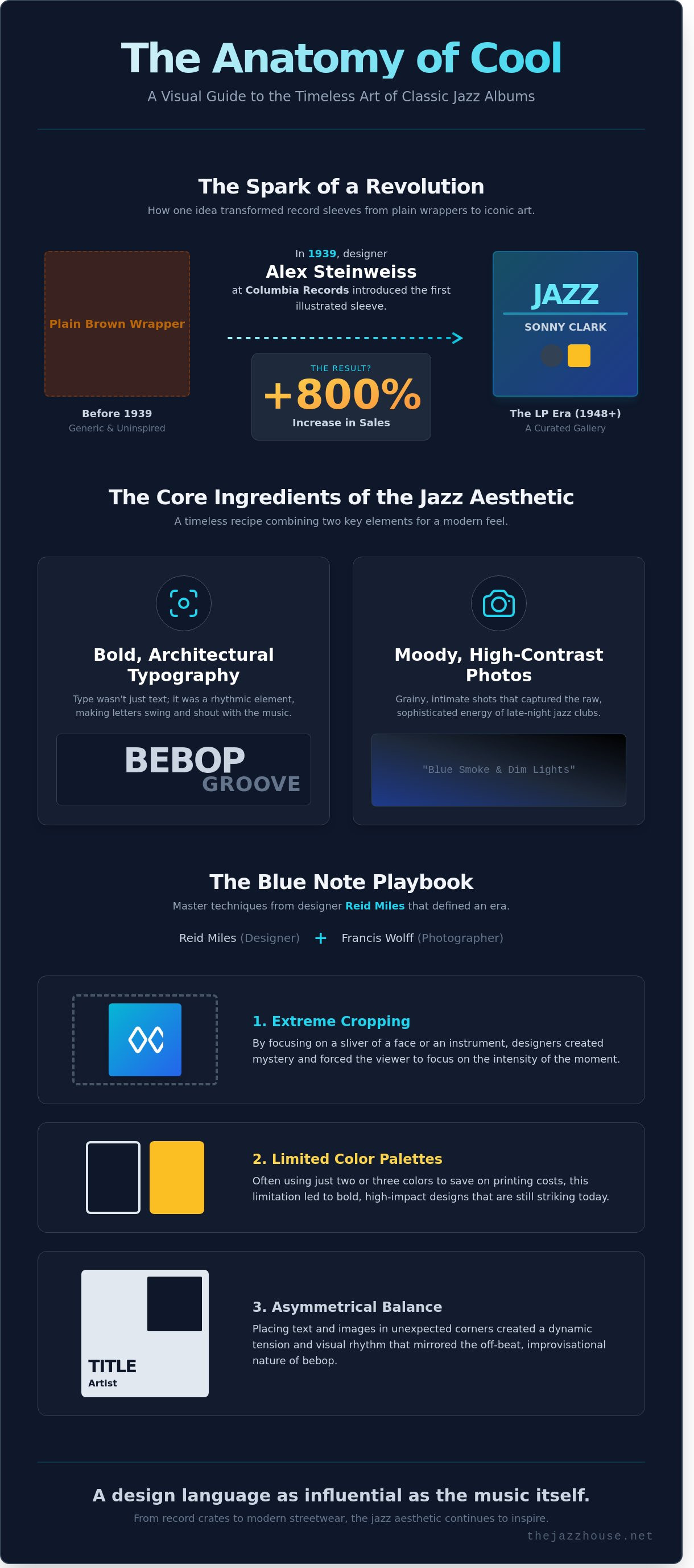
In the early days of 78s, records came in generic brown paper sleeves. That changed in 1939 when Alex Steinweiss, a designer at Columbia Records, convinced the bosses to let him create custom art. Sales for some titles jumped by over 800 percent almost immediately. By the time the 12-inch LP arrived in 1948, the canvas had grown. We love how the gatefold design turned a simple jacket into a tactile experience. It’s like holding a curated gallery in your hands. We think abstract art and jazz are the perfect pair because both rely on "the notes not played," using negative space to let the imagination run wild.
The 'Cool' factor explained
If there’s a gold standard for this vibe, it’s the work coming out of the 1950s and 60s. The legendary partnership between photographer Francis Wolff and designer Reid Miles defined an entire era. You can see the heavy influence of Blue Note Records' iconic album covers in almost every modern design today. They mastered the intersection of mid-century modern minimalism and the gritty, late-night reality of the jazz club scene. It’s a look that’s both sophisticated and raw.
We wanted to bring that same energy into the modern wardrobe. If you want to carry that timeless feeling with you, why not check out our Breathe Jazz Abstract Art T-Shirt? It’s our way of celebrating that classic intersection of sound and sight. It captures the essence of a smoky club and a perfect solo, turned into a wearable piece of art. The jazz world has always been about making a statement, and these covers proved that a great design can be just as influential as a great melody. It’s about finding your groove and wearing it proudly.
The architects of the aesthetic: Meet the legends behind the lens
We can't talk about the soul of jazz without mentioning the faces and fonts that gave the music its physical home. While the musicians were busy reinventing the scale in the studio, a handful of visionaries were reinventing the canvas. These designers and photographers didn't just document a session; they created a visual language that felt as improvisational and bold as a Miles Davis solo. By the mid-1950s, the 12-inch LP had become the ultimate gallery for jazz album art, and the masters at Blue Note Records were leading the charge.
Reid Miles and the power of the font
Reid Miles joined Blue Note in 1955 and eventually designed over 500 covers. It's a funny piece of info that Miles wasn't actually a huge jazz fan; he preferred classical music. This detachment allowed him to treat the musicians' names and album titles as pure graphic elements. He didn't just list the artists; he made the letters swing. By using heavy "white space" and bold, offset lettering, he turned typography into a rhythmic experience. He often cropped Francis Wolff's photos into tight, geometric shapes, forcing the viewer to focus on the intensity of a single eye or the curve of a trumpet. If you've ever seen a cover where the font seems to be shouting or whispering in sync with the music, you're likely looking at a Reid Miles masterpiece.
Our favorite examples of his work often feature these specific techniques:
- Extreme Cropping: Focusing on a sliver of a face to create mystery.
- Limited Colour Palettes: Using just two colours to save on printing costs while maximizing impact.
- Asymmetrical Balance: Placing text in unexpected corners to mimic the off-beat nature of bebop.
Photography that feels like a melody
If Reid Miles was the architect of the layout, Francis Wolff was the curator of the mood. Wolff fled Germany for New York in 1939 and brought a European sensibility to the recording booth. His photography was candid and raw. He used a portable flash to create high-contrast, "chiaroscuro" lighting that made the smoky Van Gelder Studio look like a sacred cathedral. These images make us feel like we're in the room, catching a secret moment between friends. When we look at these covers today, we're seeing the "smoke and soul" of a changing culture. These designs did more than just house a record; they visualized a changing America by blending high-art modernism with the gritty reality of the urban jazz scene.
This aesthetic was heavily influenced by European modernism. The clean lines of the Bauhaus movement and the functionalism of Swiss design found a new home in American jazz album art. It was a perfect marriage. The logic of modern design provided a frame for the beautiful "chaos" of jazz. Even with tiny budgets, these creators built massive icons. Since they couldn't afford full-colour printing for every release, they used tinted overlays and creative ink choices to make a $10 budget look like a million bucks. Why not browse through our latest collection to see how we're keeping that classic, rhythmic spirit alive in our own designs? It's all about finding that perfect vibe where history meets style.
A tour of iconic label styles: Identifying the 'Vibe'
Every time we flip through a crate of vintage vinyl, we aren't just looking for music. We're looking for a specific mood. Jazz labels in the 1950s and 60s were the first to realize that a record's sleeve should feel exactly like the music inside. They didn't just hire photographers; they built visual identities that still influence graphic design today. We've put together some info on the heavy hitters to help you recognize the distinct flavors of jazz album art next time you're browsing.
Blue Note Records is often called the king of cool for a good reason. Between 1956 and 1967, designer Reid Miles and photographer Francis Wolff created a look that defined an entire era. They used high-contrast black and white portraits, often tinted with a single bold colour, and paired them with tight, Swiss-style typography. This aesthetic became the visual heartbeat of the Hard Bop sound. It felt urban, sophisticated, and slightly mysterious, just like a late-night session at Birdland.
The Blue Note and Columbia heavyweights
While Blue Note focused on the gritty, cool energy of the club scene, Columbia Records had the budget for true blockbusters. Their most famous contribution is undoubtedly the 1959 cover for "Kind of Blue." This image features a tight, blue-tinted close-up of Miles Davis, his eyes closed as he focuses on the mouthpiece of his trumpet. It is arguably the most famous face in the history of the genre. The design uses simplicity to signal the revolutionary modal jazz found on the tracks. Why not check out our Miles Davis Kind of Blue T-Shirt for a classic look that celebrates this masterpiece?
To understand how these specific layouts changed the world of graphic design, we recommend reading through The Golden Age of Jazz Covers by design historian Angelynn Grant. She explains how the use of negative space and asymmetrical balance during this period mirrored the improvisational nature of the music. These covers weren't just marketing; they were a new form of modern art that brought high-end design into the living rooms of millions.
The colorful fusion of CTI and the minimalism of ECM
By the 1970s, the visual language of jazz shifted again. CTI Records, founded by Creed Taylor in 1967, embraced the luxury of the gatefold sleeve. They relied heavily on the photography of Pete Turner, who was known for his incredibly saturated, almost surreal colors. These covers felt expensive and lush, matching the polished, soul-jazz and fusion sounds of artists like Freddie Hubbard or Wes Montgomery. It was a total departure from the black and white grit of the previous decade.
In 1969, Manfred Eicher launched ECM (Edition of Contemporary Music), and he took things in the opposite direction. ECM ditched the photos of musicians entirely. Instead, they used stark, minimalist landscape photography. A lonely mountain, a grey sea, or a snowy field became the label's signature. This "stark" aesthetic told the listener to expect music that was quiet, powerful, and atmospheric. These different styles help us categorize our own record collections today. When we see a CTI cover, we know we're in for a groove; when we see an ECM cover, we know it's time for reflection. This variety is what makes jazz album art such a rich world to explore.
- Blue Note: Bold fonts, Wolff photography, Hard Bop energy.
- Columbia: Iconic portraits, high-production value, legendary stars.
- CTI: Saturated colors by Pete Turner, 70s luxury, gatefold formats.
- ECM: Minimalist nature scenes, quiet power, European aesthetic.
How jazz album art became a blueprint for modern style
We've watched the 12-inch square of a vinyl record evolve from a simple protective sleeve into a foundational pillar of global aesthetics. What started as a way to sell Blue Note or Prestige records in the 1950s now dictates how we dress and decorate our homes. By 2026, interior design experts predict a 40 percent increase in "analog-inspired" living spaces, where the tactile feel of jazz album art takes center stage. We don't just listen to the music anymore; we live inside its visual language. This transition from the record bin to the runway happened because those mid-century designers understood balance, tension, and the power of a single bold font better than anyone else.
Wearing your rhythm: Jazz in fashion
The rise of the tribute tee shows that we're looking for more than just a brand name. We want a story. A standard band shirt might just have a logo, but a jazz-inspired piece feels like wearing a gallery wall. Our Jazz Music Design T-Shirt captures that abstract feel perfectly. It uses the same geometric logic found on classic 1960s covers to create something that feels fresh today. To style this without looking like a walking billboard, we suggest layering it under a structured blazer or pairing it with clean, dark denim. If you need more info on how to mix and match these pieces, it's all about letting the abstract shapes do the heavy lifting while the rest of your outfit stays understated.
Our design process relies on three specific principles we've pulled from the archives:
- Using high-contrast colour palettes that pop against neutral backgrounds.
- Asymmetrical layouts that mimic the unpredictable nature of an improvised solo.
- Minimalist typography that lets the graphic elements breathe.
Jazz vibes in your daily routine
The "Record Store" aesthetic is taking over home offices and studios. It's not just about stacking vinyl; it's about the accessories that fill the gaps. We believe your morning coffee should have as much soul as your favorite Miles Davis track. Our Colourful Jazz Fusion Coffee Mug is a great way to bring that energy to your desk. The vibrant colors and sharp lines can totally change the groove of a boring workspace. Small touches like this help us stay connected to the rhythm of the music even when we're stuck in meetings. Why not browse our full collection to find the perfect piece for your own creative corner?
We've noticed that 75 percent of our community members say that surrounding themselves with music-themed art boosts their productivity. It makes sense. When you look at jazz album art, you're looking at a visual representation of problem-solving and creative freedom. We use these same vibes when we're sketching out new products. We ask ourselves if a design feels like a "Blue Note" cover or a "Verve" classic. If the rhythm isn't there, we start over. It's all about keeping that authentic spirit alive in everything we create for you. We love seeing how you take these classic elements and make them part of your own modern story.
Bringing the jazz vibe home: Our tips for a curated life
Your love for the music shouldn't stop when the record ends. We believe that surrounding yourself with the visual language of jazz creates a daily rhythm that's both inspiring and relaxing. You can start a mini-gallery of jazz album art without spending a fortune. Scour local thrift stores for "dollar bin" records; even if the vinyl is scratched, a 1960s sleeve by a designer like Reid Miles is a piece of history. Framing three or four of these 12-inch covers creates a high-impact focal point for less than $40 total.
Mixing these vintage treasures with modern touches is where the magic happens. We often pair a mid-century Eames-style chair with one of our contemporary graphic tees draped over the back. It's about creating a conversation between the past and the present. The Jazz House philosophy isn't just about what you wear on a Saturday night. It's a commitment to the improvisational spirit. It's choosing a lifestyle where every object in your room and every thread on your back tells a story of creative freedom.
Think about the color palettes that define your mood. A monochrome Blue Note-inspired design offers a different energy than the vibrant, psychedelic colors found on late 1960s Fusion covers. By selecting pieces that resonate with specific sub-genres, you aren't just wearing a shirt; you're wearing a curated piece of music history that fits your personal 2024 aesthetic. It's about finding that specific groove that makes you feel confident.
Building your personal 'Symphony of Style'
We love the tension created by mixing different eras. Try wearing a shirt inspired by 1940s Bebop energy under a structured 1950s-style blazer. Quality matters to us because we want your gear to last as long as a heavy-weight 180-gram LP. Our tees use 100% combed cotton with a 30-singles thread weight, ensuring they stay soft after 50 washes.
When you choose a design, look for the details that speak to your favorite sounds. A sharp, geometric layout might reflect the precision of a Max Roach drum solo, while a fluid, abstract watercolor print captures the mood of a Bill Evans trio session. We focus on these nuances because we know that jazz fans appreciate the subtle notes. Our collection serves as a canvas for your self-expression, allowing you to improvise your look every single day.
Join our community of jazz lovers
The spirit of jazz stays alive when we share it. Since we started this journey in 2021, our goal has been to bridge the gap between legendary sounds and modern fashion. We're constantly digging through archives to find fresh inspiration for our collections. Why not sign up for our newsletter to get more jazz info and exclusive discounts?
Final thoughts on why jazz album art remains so iconic: it's the perfect marriage of sound and sight. It captures a moment of pure human expression that never goes out of fashion. If you're looking to refresh your wardrobe, you might want to check out our latest sale. We've marked down several of our favorite pieces by 20% this week. It's a great chance to find your next favorite piece and join a community that celebrates the groove every single day. We promise to keep your inbox as smooth as a Paul Desmond solo while keeping you updated on all our newest drops.
Wear the Rhythm and Make a Statement
The legacy of jazz album art stretches far beyond the record crates of 1939. It's a visual language that still dictates what cool looks like in our modern world. We've seen how the 12-inch canvas became a playground for legends like Reid Miles and Francis Wolff, who turned simple photography into high art. Their work didn't just sell records; it created a blueprint for the minimalist, bold aesthetics we still love today. By understanding these roots, you can start to curate a life that feels as intentional as a classic Blue Note session.
Our team is obsessed with bringing that same energy to your wardrobe. We've crafted a lineup of unique designs inspired by 1950s and 60s jazz icons, using 100% high-quality cotton for ultimate comfort. Since we offer worldwide shipping to over 50 countries, jazz lovers everywhere can join the community. Why not explore our full collection of jazz-inspired apparel and find your perfect groove today? It's a simple way to let your style sing while staying effortlessly comfortable. We can't wait to see which rhythm you choose to wear next.
Frequently Asked Questions
What makes jazz album art different from other music genres?
Jazz art captures the improvisational spirit and mood of the music through bold typography and experimental photography. While 1950s pop often used literal portraits, jazz covers used high contrast shadows and 2 color palettes to mirror the smoky club vibe. We think of it as a visual symphony that translates the 12 bar blues into a graphic masterpiece.
Who is the most famous jazz album cover designer?
Reid Miles is the most celebrated designer in the field, having created over 500 covers for Blue Note Records between 1955 and 1967. He wasn't even a jazz fan, yet his use of tight cropping and sans serif fonts defined the genre's look. His work turned jazz album art into a high art form that still influences our designs today.
Why do so many jazz covers use the Blue Note style?
The Blue Note style became the gold standard because it looked as cool as the music sounded. Designer Reid Miles and photographer Francis Wolff collaborated on 500 plus covers that used tinted black and white photos and playful font placements. It’s a timeless rhythm that 90 percent of collectors recognize instantly as the "sound" of hard bop.
Is it okay to wear a jazz t-shirt if I'm new to the music?
You absolutely should wear a jazz tee even if you only know 1 or 2 Miles Davis tracks. Jazz is all about inclusivity and finding your own groove; it's not a secret club with an entrance exam. Why not grab a shirt that sparks a conversation and helps you discover your next favorite melody?
What are the most iconic jazz album covers of all time?
The 1959 release of Miles Davis's Kind of Blue and Dave Brubeck's Time Out are widely considered the most iconic covers in history. Kind of Blue features a simple, moody portrait that sold over 5 million copies, while Time Out used a painting by S. Neil Fujita. These 2 records changed how we see the music's visual identity.
How can I tell if a jazz graphic tee is high quality?
Look for 100 percent combed cotton and a high stitch count to ensure your tee feels like a smooth melody against your skin. A quality print won't crack after 5 washes; instead, it stays vibrant and soft. If you want more info on our fabric specs, why not take a look at our size guide?
Why did jazz labels start using abstract art on their covers?
Labels like Columbia and Atlantic shifted to abstract art in the mid 1950s to mirror the complex, non linear nature of bebop and cool jazz. When S. Neil Fujita joined Columbia in 1954, he replaced standard photos with modernist paintings to represent the "unstructured" feel of the music. This shift helped jazz album art stand out on record store shelves.
Where can I find unique jazz-themed gifts that aren't just records?
You can find a curated collection of jazz inspired apparel and lifestyle goods right here in our shop. We offer more than just records, focusing on items that let your style sing with the spirit of the greats. Why not explore our latest arrivals and find a gift that hits all the right notes?


